A logo often says more about a company than an entire advertisement campaign. In today’s digital world, people form opinions within seconds, and the midi health logo has become an instantly recognizable symbol in the growing women’s telehealth space.
As virtual healthcare platforms continue to expand, branding plays a major role in building trust, comfort, and emotional connection with patients. For companies focused on sensitive health concerns like menopause and hormonal wellness, visual identity matters even more. Patients want healthcare that feels modern, supportive, calming, and professional all at once.
The midi health logo reflects a larger movement happening in healthcare—one centered around accessible, compassionate, and personalized care for women navigating midlife changes. In this article, we’ll explore the design elements behind the logo, the psychology of healthcare branding, how the company uses its visual identity, and why branding matters so much in digital medicine.

What Is Midi Health?
Before diving into the design itself, it helps to understand the company behind the branding.
Midi Health is a telehealth platform focused on menopause and midlife women’s healthcare. The company connects patients with licensed medical professionals through virtual consultations designed specifically for hormonal wellness and menopause support.
The Company’s Core Focus
The platform mainly helps women dealing with:
- Perimenopause
- Menopause symptoms
- Hormonal changes
- Sleep disruptions
- Mood shifts
- Hot flashes
- Weight concerns
- Sexual wellness issues
Because the company operates in a highly personal area of healthcare, its branding must communicate trust and reassurance immediately.
Why Branding Matters in Healthcare
Healthcare branding is very different from branding in entertainment or retail.
Patients often choose healthcare providers based on feelings like:
- Safety
- Trust
- Compassion
- Professionalism
- Emotional comfort
A well-designed healthcare logo helps create those emotional signals quickly.
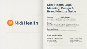
Understanding the Midi Health Logo
The midi health logo appears simple at first glance, but simplicity is often intentional in modern healthcare branding.
Many successful digital health companies use clean, minimalistic designs to communicate clarity, calmness, and accessibility.
Visual Simplicity Builds Trust
Modern patients are overwhelmed with medical information, wellness influencers, and competing health platforms. A cluttered or overly aggressive logo can create anxiety instead of confidence.
Minimal healthcare logos often aim to feel:
- Clean
- Calm
- Human-centered
- Easy to recognize
- Professional without feeling cold
The Midi Health branding aligns closely with these modern design principles.
Typography and Font Style
Typography plays a huge role in healthcare branding psychology.
Soft, rounded fonts often communicate:
- Warmth
- Compassion
- Accessibility
- Friendliness
Sharp or rigid fonts, on the other hand, may appear overly corporate or intimidating.
The font styling associated with the midi health logo appears modern and approachable, which matches the company’s focus on personalized women’s healthcare.
Color Psychology in Healthcare Logos
Healthcare brands carefully choose colors because colors influence emotions and trust perception.
Common healthcare branding colors include:
- Blue for trust and reliability
- Green for wellness and balance
- Purple for calmness and care
- Soft neutrals for comfort
Women-focused wellness companies often avoid harsh, clinical color palettes in favor of softer, more calming visual tones.
The Symbolism Behind the Midi Health Brand
A healthcare logo is rarely just decoration. It usually reflects a company’s mission and emotional identity.
Emotional Comfort and Midlife Care
Menopause is deeply personal. Many women experience symptoms that affect sleep, confidence, relationships, and emotional well-being.
Because of this, the branding likely aims to feel:
- Supportive
- Nonjudgmental
- Modern
- Empowering
- Calm rather than clinical
The midi health logo fits into a broader trend of healthcare companies trying to humanize medicine.
Digital-First Healthcare Identity
Telehealth companies operate differently from traditional clinics.
Patients often interact with the brand through:
- Websites
- Mobile apps
- Video appointments
- Social media
- Digital prescriptions
- Email communication
That means logos must work well across screens, mobile devices, and digital interfaces.
Simple designs typically perform better in digital environments.
Why Healthcare Logos Matter More Than Ever
Healthcare branding used to focus mainly on hospitals and insurance companies. Today, digital healthcare companies compete directly for patient trust online.
Patients Judge Brands Quickly
Research consistently shows that visual branding affects first impressions within seconds.
Before reading reviews or booking appointments, people subconsciously evaluate:
- Website design
- Logo appearance
- Color palette
- Overall professionalism
This is especially true for healthcare services involving sensitive conversations.
The Rise of Women-Focused Wellness Brands
Women’s healthcare branding has evolved significantly over the past decade.
Older healthcare branding often felt:
- Clinical
- Cold
- Corporate
- Impersonal
Newer women’s health platforms instead focus on:
- Empathy
- Inclusivity
- Comfort
- Community
- Emotional understanding
The midi health logo reflects that broader shift toward patient-centered healthcare branding.
How the Midi Health Logo Supports Brand Recognition
Strong logos help companies become memorable in crowded industries.
Consistency Across Platforms
Successful digital healthcare companies use consistent branding across:
- Websites
- Social channels
- Apps
- Educational materials
- Advertising
- Email communication
Consistency helps patients feel more familiar and comfortable with the brand over time.
Emotional Association
Over time, people begin associating logos with experiences and emotions.
For healthcare brands, positive emotional associations may include:
- Relief
- Feeling heard
- Better health outcomes
- Compassionate treatment
- Accessibility
That emotional connection can significantly affect brand loyalty.
Building Patient Trust
Healthcare decisions involve vulnerability. Patients want reassurance before sharing personal medical concerns.
Professional branding helps signal legitimacy and care quality. Here you can know about: Midi Health Locations: States, Access & Virtual Care.
The Role of Minimalism in Modern Healthcare Branding
Minimalism has become one of the defining trends in healthcare design.
Why Simpler Designs Work Better
Minimal logos tend to be:
- Easier to remember
- Cleaner on mobile screens
- More versatile
- More modern-looking
- Less visually stressful
This matters especially for telehealth platforms where nearly every interaction happens digitally.
Avoiding Overly Clinical Imagery
Older medical logos often relied heavily on symbols like:
- Crosses
- Heartbeats
- Stethoscopes
- Medical shields
Modern wellness brands increasingly avoid these clichés in favor of softer, more lifestyle-oriented branding.
How Branding Affects Patient Experience
Branding doesn’t just influence marketing—it can shape how patients emotionally experience healthcare.
Comfort Reduces Anxiety
Women seeking menopause care may already feel frustrated, confused, or emotionally exhausted.
A calm and approachable brand identity can help reduce stress before appointments even begin.
Visual Identity Supports Communication
Clear branding creates consistency and familiarity, which improves the user experience across digital platforms.
Human-Centered Healthcare Design
Healthcare companies increasingly recognize that emotional design matters just as much as functionality.
The midi health logo contributes to a more welcoming digital healthcare environment.
Comparing Midi Health Branding to Other Telehealth Companies
Healthcare branding trends vary widely depending on audience and specialty.
Traditional Telemedicine Branding
General telehealth brands often emphasize:
- Technology
- Speed
- Efficiency
- Convenience
Their branding may appear more corporate or tech-focused.
Women’s Wellness Branding
Women-focused healthcare companies tend to prioritize:
- Soft color palettes
- Minimalist typography
- Warm emotional tone
- Inclusive imagery
The midi health logo aligns more closely with wellness-centered branding than traditional healthcare systems.
The Shift Toward Lifestyle Healthcare
Modern telehealth companies increasingly blend healthcare with wellness aesthetics.
This helps make healthcare feel:
- Less intimidating
- More accessible
- More conversational
- More personalized
The Importance of Trust in Digital Healthcare
Trust is one of the biggest challenges for online healthcare platforms.
Patients Need Reassurance
When booking virtual appointments, patients cannot physically see clinics or staff beforehand. Branding becomes part of the trust-building process.
Professional Design Signals Credibility
Well-designed healthcare brands often appear:
- More legitimate
- More organized
- More reliable
- More patient-focused
That visual confidence matters greatly in competitive healthcare markets.
Branding and Long-Term Loyalty
Patients who feel emotionally comfortable with a healthcare brand are more likely to:
- Continue treatment
- Schedule follow-ups
- Recommend services
- Engage with educational content
Could the Midi Health Logo Change Over Time?
Most successful brands eventually refine or modernize their logos.
Why Companies Rebrand
Healthcare companies may update branding to:
- Reflect growth
- Expand audiences
- Modernize design
- Improve digital performance
- Strengthen market positioning
Maintaining Brand Recognition
Strong brands usually evolve carefully so patients still recognize the company instantly.
Even subtle logo changes can significantly affect public perception.
Public Perception of the Midi Health Brand
The growing visibility of the midi health logo reflects broader interest in women’s telehealth services.
A Growing Conversation Around Menopause
Menopause discussions are becoming more mainstream in healthcare and media.
This cultural shift has increased attention on companies focused specifically on women’s hormonal health.
Visibility Across Social Media and Digital Platforms
Healthcare branding now extends far beyond websites.
Patients encounter brands through:
- TikTok
- Online ads
- Podcasts
- Educational webinars
- Mobile apps
A recognizable logo helps maintain consistency across all these channels.
FAQ
What does the midi health logo represent?
The logo appears to represent modern, approachable, and patient-centered healthcare focused on women navigating menopause and hormonal wellness.
Why is the midi health logo minimalist?
Minimalist logos often create feelings of calmness, clarity, professionalism, and trust—qualities especially important in healthcare branding.
What industry does Midi Health belong to?
Midi Health operates in the telehealth and women’s healthcare industry, with a focus on menopause and midlife wellness.
Why are healthcare logos important?
Healthcare logos help patients quickly assess professionalism, trustworthiness, emotional comfort, and brand identity.
Does branding affect patient trust?
Yes. Strong healthcare branding can influence first impressions, emotional comfort, and long-term patient confidence.
What colors are commonly used in healthcare logos?
Healthcare companies often use blue, green, purple, and soft neutral colors because they are associated with trust, wellness, calmness, and care.
Is the midi health logo designed for digital platforms?
Like many modern telehealth brands, the logo appears optimized for websites, mobile apps, and online communication.
Why do telehealth companies focus heavily on branding?
Because most interactions happen online, branding helps create familiarity, professionalism, and emotional connection before patients even meet providers.
Could Midi Health redesign its logo in the future?
Yes. Many growing healthcare companies refine their branding over time to stay modern and align with evolving audiences.
Conclusion
In today’s digital healthcare landscape, branding is far more than decoration—it’s part of the patient experience itself. The midi health logo reflects a modern healthcare philosophy centered around accessibility, empathy, and personalized support for women navigating midlife hormonal changes.
Its clean design, approachable style, and calm visual identity align with the broader evolution of women’s telehealth branding. As healthcare becomes increasingly digital, companies must create trust not only through medical care but also through the emotional signals their brands communicate.
For many patients, the first interaction with a healthcare company happens through a logo on a screen. That’s why thoughtful branding matters so much. The midi health logo represents more than a visual mark—it symbolizes a changing conversation around menopause care, women’s wellness, and the future of accessible healthcare.